Is this the fairest congressional map?
Nate Silver and his team FiveThirtyEight (Aaron Bycoffe, Ella Koeze, David Wasserman) did an enormous job creating not just one, but seven different types of maps to represent different congressional districts based on specific goals.
For example, one of the goals is “maximize the Republican gerrymander.” Here’s what my state of Washington would look like under a Republican gerrymander:

As you can see, for the ten representatives the state of Washington sends to Congress, in a Republican gerrymander, four would be “usually Republican”, four would be “usually Democrat”, and two would be “highly competitive”.
They define highly competitive as each party have a 1/6 (17%) or greater chance of winning the district.
While 17% for each party doesn’t like a lot, let’s keep in mind most districts today have a 90% chance of going to one party or another.
(Actually this project looks much better on mobile than on desktop. Information overload on desktop.)
Using a computer to optimize goals
Computers are extremely powerful tools, and they can optimize certain goals given a set of data and some basic coding.
They were able to make maps based on a state goal, such as “Gerrymander districts to favor Republicans”, which drew every state’s map in such a way as to maximize the advantage of Republicans going forward.
One of the seven maps, or goals the team set in this project, is “make districts compact”. This is a brilliant computer algorithm developed by Brian Olson, which takes each district and MINIMIZES the average distance between each constituent and their district’s geographic center.
In other words, you are going to be in a district, with the same people who live nearby you. Olson, in his TED talk here, says that in a place like Florida if “districts are made compact”, you’ll live an average of 25 miles from the people you vote with, instead of the current districts which are drawn in such a way as to stretch people across huge swaths of the state.
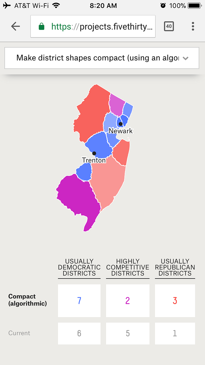
Believe it or not, this simple and elegant solution makes a map that originally looks like this:

Now look like this:

If you knew nothing about politics, if you were simply “an intelligent man on the street”, as Justice John Roberts proposed as a test for whether a map was drawn fairly, which would you say is more fair?
If you knew nothing, which looks like it more fairly represents the people of New Jersey?
Continuing this further, the folks at FiveThirtyEight took Olson’s idea one step further. Instead of simply minimizing the distance from a constituent to his/her district’s geographic center, could you do something similar, but respect current county boundaries as best you can?
The answer is yes. This is what the map looks like with the additional element of being mindful of county boundaries:

It’s a beautiful map that just looks a lot more fair.
This can be done for every state in the country. Here’s the current map of Texas:

Currently, if you look closely enough, you can see Austin doesn’t have Democratic representation, despite being one of the most liberal places in the country. The city of Austin is split among so many districts that each district is Republican.
Here is Texas drawn to be “compact”, without regard to county borders:

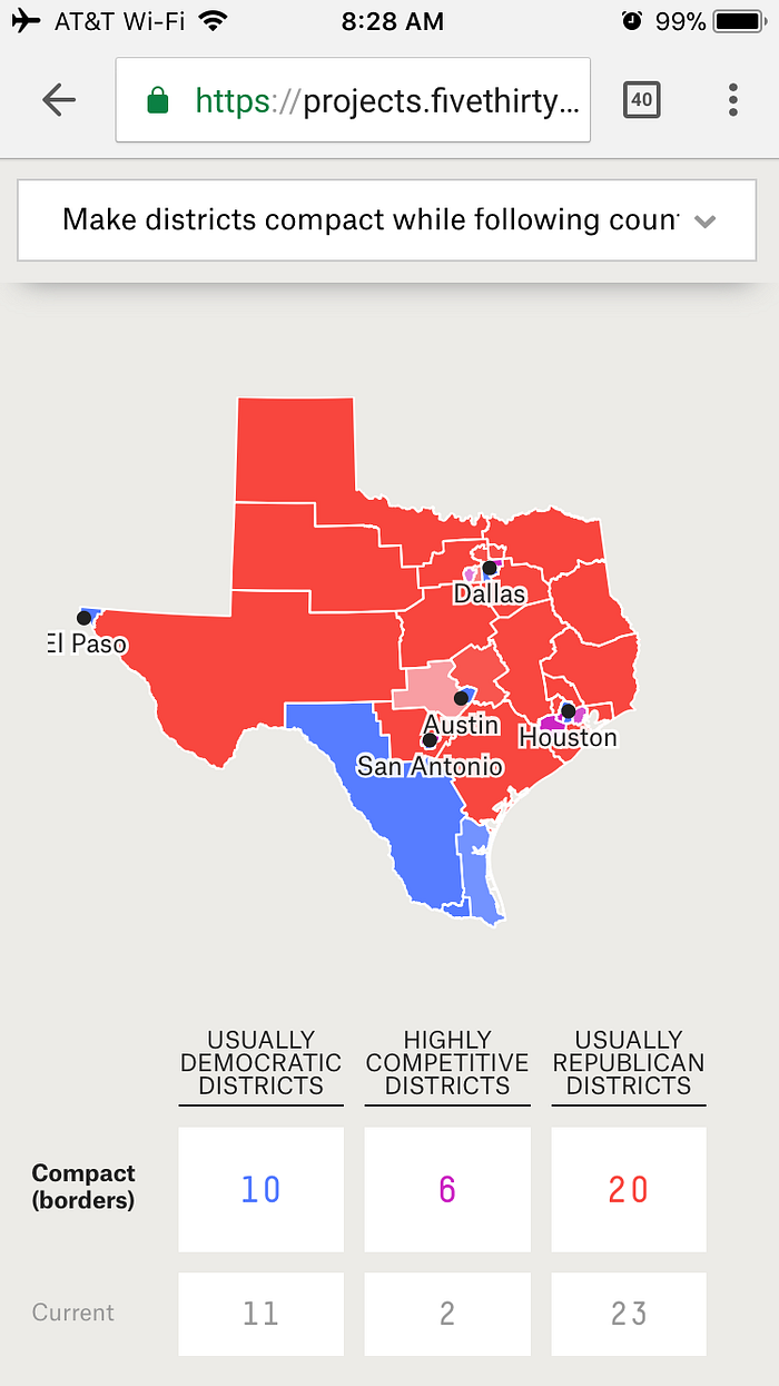
Here it is drawn when county borders are followed as best they can:

Again, which looks more fair? Which looks like it better “represents” the constituents who live in that area.
Now you might notice that even with the better maps, the expected number of usually democratic and usually Republican districts doesn’t change all that much.
In Texas, even this fairer map, means from the current 11 districts that usually vote Democrat and 23 that usually vote Republican, there are now 10 that usually vote Democrat and 20 that usually vote Republican. The number of highly competitive districts goes from two currently up to six.
So while the numbers of “safe” districts for Republican and Democrats doesn’t change, the change here is that there are more competitive districts. The bias that discourages competitive districts has largely been removed from the map drawing process.
Even if the outcome doesn’t change, that’s okay. The point of redrawing these maps is not to change the outcome, as much as it is, to level the playing field.
When you extend this design to a NATIONAL level, you’ll notice something interesting:

The difference between the “Current” map, and the “Compact (borders)” map is a mere three congresspeople!
In other words, the way the map is currently drawn, the breakdown should be:
- 201 Democrats
- 234 Republicans
(These numbers in the table above represent how likely the party is to win these seats over the long-term. In reality, there are currently 193 Democrats and 238 Republicans, with 4 vacant seats in Congress today.)
This includes all the gerrymandered states included like North Carolina (the most egregious), Wisconsin, Texas, Pennsylvania, and Maryland.
Now if districts were redrawn to be compact, in other words, you vote with your neighbors, and to respect the current county boundaries when possible, the new expected Congress would be:
- 204 Democrats
- 231 Republicans
What do you notice here?
A fair map is hardly different from the current one! Just three votes difference!
How is that possible?
The reason is that while a state can be badly gerrymandered, it might only mean one seat from that entire state ought to switch hands. That’s what would happen if a large state like Texas for example, was redrawn to be more fair. While more Republican states are gerrymandered than Democratic ones, there are some states where districts are drawn to favor Democrats, like Maryland, and resetting those maps as well will cause things on a national level to even out.
So on a national level, the average number of seats held by one party or the other shouldn’t change much if maps were better drawn.
But what IS largely different, is the number of competitive districts.
Currently, there are 72 “highly competitive” districts, which again is defined as each party having at least a 17% chance of winning the district, based on long-term voting trends.

With the maps drawn to be compact and to respect county boundaries, there are now 99 highly competitive districts.

In a map drawn to more or less eliminate gerrymandering, there would be:
- 155 Usually Democratic districts,
- 181 Usually Republican districts,
- and 99 Highly Competitive district
So the number of “highly competitive districts”, if maps were to be redrawn fairly, would go from 72 districts, to 99 districts.
This means, in a swing election where there is a change to the national mood, Congress can more accurately represent the people.
And that’s exactly how Democracy should look. You should be represented by the people who live closest to you, and in cases where people feel strongly for one party or another, there should be competitive districts to allow the populace to move the entire country in one direction or another.
This is what the founders would have wanted, when they wrote to avoid a “tyranny of the majority”. When one party designs a system to keep as few districts competitive as possible, it’s bad for everyone.
